Wednesday, September 19, 2012

1963 - Roy Lichtenstein and Pop Art

     Welcome back, folks!  For this post, I'll be doing something a little different.  instead of covering one specific work, I'm going to be covering a particular artist that had 4 pieces released this year!  I'm also going to speak a bit about the artistic movement he was a part of.

     The artist in question is one Roy Lichtenstein, and his four works are as follows:


"Drowning Girl" 1963
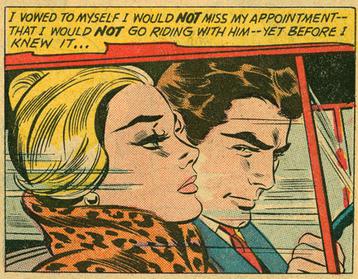

"In The Car" 1963


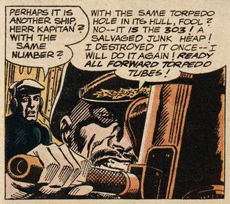
"Torpedo...Los!" 1963
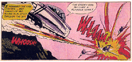

"Whaam!" 1963
     Lichtenstein had a penchant for making works based on comic strip panels.  In fact, each of these works is based on existing panels.  I feel the best way to represent them is to go through each one individually.  So let's do that!

     "Drowning Girl" - Derived from Tony Abruzzo's panel in "Run For Love" from DC Comics' Secret Hearts #83.  Lichtenstein's painting is cropped significantly, omitting the entire scene occurring, and opting instead to just show the girl's face.  In addition, the text was changed from "I don't care if I have a cramp!  I'd rather sink than call Mel for help!" to "I don't care-- I'd rather sink than call Brad for help!"  Lichtenstein has stated the intention of this piece being to depict extreme melodrama.  Even the decision to change the boyfriend's name to Brad was in service of this.  Lichtenstein felt that Brad was a more cliche'd heroic boyfriend name.

     "In The Car" - Based on a panel from edition #78 of the series Girls' Romances.  The changes from the original panel are relatively minor.  The frame is moved down and cropped ever so slightly, since the text bubble has been removed.  In addition, a lot of the background details (speed lines, window reflections) have been simplified so as not to detract from the drama between the man and woman.  Also, the woman's hair had been let down, and flows out behind her, adding a more dramatic flair to the image.  This and the previous image followed a trend of depicting tense melodrama between a man and woman.

     "Torpedo...Los!" - Derived from a panel from DC Comics' Our Fighting Forces (edition unknown).  Many alterations have been made to the original image.  For one, the image has been cropped slightly and the frame moved down.  This makes the Captain the biggest, most dominating force in the frame.  In addition, the detailed, wordy declaration of the captain has been replaced with a shorter, more vague command.  In addition, the backdrop of the submarine and its periscope have been made to look more futuristic.

     "Whaam!" - Adapted from the story "Star Jockey," from All-American Men of War #89 by DC Comics.  The most immediate change to this panel is that the smoke trail of the torpedo has been moved under the plane wing, revealing more of the fuselage.  The text bubble on the left side of the frame has been moved towards the center, and the pilot's spoken text has been removed entirely.   The exploding plane in the picture is almost completely different form the original.  There is significantly less shown of the plane itself, and the artistic style of the explosion is very different.


A Brief Breakdown of Pop Art

     If you've ever forayed into the world of art history, you've undoubtedly heard of Pop Art.  The above piece was one of the earliest recorded pieces of Pop Art.  Pop Art emerged in the 1950s and served as a sort of counter-culture movement to the fine art of the period.  It often used cultural icons (especially those of the fine art it was fighting against, but also advertisements and comic books), and removed them from their original contexts, creating a more abstract, incongruous visual image with a very kitschy style to it.

My Opinion

     I'm a huge fan of Roy Lichtenstein's work.  This probably partially stems from the fact that I'm a big fan of comic book artwork and the pop art style.  I also like Lichtenstein's intent not to make any sort of bold, sweeping statement, but rather to portray and emotion or a situation with his art.  Can't really think of what else to say about Lichtenstein, so I'll leave it at this:  great art, check it out.  See you next time!

Tuesday, September 18, 2012

Post Number 2 - 1961

     Hello all, and welcome back!  Today, we'll be covering a piece of art from 1961.  It's a little piece by a fairly unknown artist, you may not have heard of him, went by the name M.C. Escher.


It's not the 60s without some trippy optical illusions, right?
     This piece is titled "Waterfall" and was created by M.C. Escher, as I mentioned.  If you don't know who M.C. Escher is, leave now here's a piece you may recognize:

Relativity, 1953.  I like to call it "Crazy Stairs"
     Now, one important thing to note about this piece (for the sake of the blog) is that it wasn't made in any particularly noteworthy period of time in Escher's life.  So, for this segment, I'm just going to talk about Escher in general and some interesting notes about this image in particular.

     M.C. Escher was most famous for his illustrated illusions, usually architectural in nature, that played with concepts such as tessellations and infinity.  The architectural aspect of his art was most likely inspired by his carpentry work as a young child until he was 13 years of age.  Escher was born Maurits Cornelius Escher (20 points to whoever can figure out where he came up with his nickname) in the Netherlands.  He was a sickly boy with a recurring skin infection.  Escher performed poorly in school and failed several times, while excelling at drawing (big surprise).

     Escher's first printed work was entitled "Still Life and Street."

Still Life and Street, 1937.
     Escher's style was definitely beginning to emerge in this piece, although it airs more on the side of surrealism than his later illusions.

     One interesting thing to note about "Waterfall" is that the titular waterfall and the paths of the aqueducts in the image create a Penrose Triangle.  

Obviously it's not exactly the same, but the principal is there.
     Another interesting little tidbit about "Waterfall"is that the very large plants in the bottom left-hand corner are actually magnified views of moss and Lichen that Escher drew in 1942 as part of a study.

And you thought he was just being weird.  Hava a little faith, will ya?

My Opinion

     I love this piece, in fact, I love most of Escher's work.  Who doesn't?  Even if you're not the type to look deeper into a piece of artwork and discover it's hidden meaning, you have to admit that there's a sense of fun to the impossible realities he creates.  One thing I've always been a fan of is using realism to create the unreal.  The technical side of Escher's work (form, style, etc.) is very much based in realism, but these techniques are used to create something impossible, and that's something I really admire.  You've no doubt seen Escher's work everywhere already, so if you're not a fan yet, you probably never will be.  But, if you live under a rock and love surrealism, definitely check his work out.   It's really great.

     Well, that's all for this entry.  Join me again next time!


Monday, September 3, 2012

First Post, Yaaaay!

     Well, here we are, with my first blog post regarding the art of the 60s and 70s.  First, I feel I should make a small note regarding a change to the format of the blog.  Instead of sticking with themes in terms of artistic movements, I'm going to simply pick one piece from each year of both decades.

     So, without further ado, allow me to introduce our first piece!  Starting in 1960:


Sorry about the watermark, folks.  This isn't the most readily available painting on the net

     This piece is entitled "Les Cornes Du Desir," or "The Horns of Desire."  The artist is Rene Magritte.  Now, you may recognize the name, or even the style, if you're extra fancy.  Magritte is most famous for this work:


I wonder if he's ever gotten hungry with that apple in front of him all the time?


     "The Horns of Desire" is from a period of Magritte's career defined as the "Mature" period, that began officially in 1949.  Prior to this period, Magritte had briefly forayed into surrealism during his "Vache" period.  

La Belle Captive (The Fair Captive), 1947.  A demonstration of Magritte's attempt at surrealism.
Opinions vary, I'm sure, but I'm not a fan.

     His "Mature" period can be viewed as a return to, and a polishing of the style Magritte had introduced during his "Sunlit" period.  The style is still very much present: the majority of the piece is based in realism, but the almost dull aesthetic of the piece is offset by various elements of surrealism, often in favor of some form of symbolism. 

L'Aiguinon (The Goad), 1943.  A woman with a devil tail.  Case in point. 

     So somehow, Magritte's foray into surrealism actually made his previous style cleaner and crisper, with much more solid brush strokes, more minute details, and sharper edges.

My Opinion

     I personally love "Les Cornes Du Desir," and in fact have been a passive fan of Magritte's for a while now.  In fact, his style really reflects a lot of my own personal tastes.  When I was young, I started out wanting to be entirely realistic in my drawing style.  When I realized that that wasn't my thing, I moved into more cartoony and surreal territories.  However, my roots remained ingrained in realism, and that's a lot of what Magritte's style has going on that makes it so unique.

     His use of stilted, static images really emphasizes the off-kilter nature of the elements of surrealism in his paintings.  Overall, I'd say Magritte is definitely an artist to learn more about.

     I know I may have cheated a bit by including him here, since the 60s weren't really his time period, but I figured I should start with something I'm familiar with.

So, that's one entry in the can, and at least 19 more to go!  I hope you've enjoyed reading and learning just as much as I've enjoyed writing :)

-Bryan S.