Tuesday, February 19, 2013

1971 - I Know I Skipped 1970, Shut Up

     Who here likes The Doors?  Everyone? Good.  This is The Jim Morrison Triptych by T.E. Breitenbach:


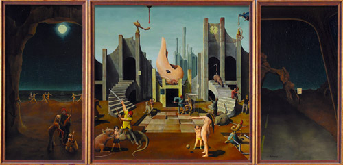
Jim Morrison Triptych - 1971
     NOTE: for descriptions of each panel of the triptych, I will be referring to direct quptes from Jim Morrison.  If you would like to find these quotes, a photo archive of the letters sent to the artist can be found at this address:

http://tebreitenbach.com/archives/articles/1970-71-Morrison_letters_O.htm


     Panel 1: "The left panel depicting a radiant moon-lit beach and an endless stream of young naked couples running silently along the water's edge. On the beach, a tiny infant grins at the universe and around its crib stand several ancient, old people."  


     According to a Morrison biographer Jerry Hopkins (whose letters can also be found at the link above), this panel was meant to be a variation on a dream Morrison may or may not have had; not a whole lot of info there.  Let's see what we can find.


     For starters, there are the naked people.  They run in couples along the beach, a sense of freedom and a devil-may-care attitude are depicted through their mid-run stances.  In the mid-ground, a large rock formation (which looks structurally similar to the one farther off in the distance in panel 3) creates a plane, separating them from the aforementioned infant and ancient, old people.


     What is interesting to note about the placement of all these people is how clearly separated they are, and not just by the rocks.  There is a break in the string of naked people directly above the infant and its elders, which leads directly up to the moon.  This shows a very clear distinction between the two worlds of these various people.  The people running are the free spirits: uninhibited, enjoying all they can of nature and its wonders.  While the infant and elders represent the dreamers: always looking onward to bigger and better things, better worlds; straight from birth they are taught to look for more.


     Panel 2: "The center, a modern city or metropolis of the future at noon, insane with activity."


     Jerry Hopkins' take on this panel is that it is "an extension of [Morrison's] interest in chaos and insanity."


     In this panel, we can see many things happening.  What exactly is happening is a challenge unto itself.  In a very abstract way, this panel could serve as a parallel to the human brain.  


     NOTE: When I say "frame left" or "frame right" in the following paragraph, I mean the left or right side (respectively), facing outward from the painting.  So to the viewer, "frame left" means their right, and vice-versa.


     To the left of the image (frame left) we can see the representation of the left side of the brain: the analytical side.  In the background, large, straight structures pierce the sky just behind a large, stone structure.  On this structure hangs a clock, symbolizing organization and order, fixed firmly at 12:05.  


     In the tableau beneath this, we can see a monkey, a symbol of spontaneity being held in a cage and prodded by a man with a stick; here, creativity is held captive and taunted by logic and order.  


     In the foreground, a boy receives a lesson in the forces of gravity.  The other people cluttering this space represent the necessity for logical perceptions to be bolstered by the logical perceptions of others; things like scientific observations and hypotheses.


     The rats, representing the pestilence and dirtiness of reality are allowed to roam freely, without interruption; the objective worldview of the left brain gives an uncompromising look at one's surroundings.


     Frame right (the creative brain) in some ways mirrors frame left, but has its share of differences.  For example, instead of large, polygonal structures rising through the sky, we see an abstract, fishlike shape rising from the center of the image, but leaning more towards frame right.  Even the stone structure (noticeably lacking a clock) is arranged in a much less orderly way, seemingly in a state of disrepair.


     In this portion of the frame, people are almost entirely absent.  The only people around are a small boy playing with a monkey, much like the caged one on the other half of the frame; a man with a spear and sword slays one of the giant rats, closing the brain off from the tragic, realistic world outside, while another rat assaults a small boy nearby: the dirty outside world attacking the youth-like innocence of creativity.


     Panel 3: "The last panel, a view through a car windshield at night on a long straight desert highway."


     Jerry Hopkins posits: "The final panel refers to a scene from his childhood when [Morrison] and his father came upon an overturned truck, dead and injured Indians scattered 'on dawn's highway bleeding.'"


     Well, we have a bit more info now.  So how do we get to an image of a blank stretch of road from "dead and injured Indians 'on dawn's highway bleeding?'"  I feel the most likely answer is that this dark stretch of pavement represents the pursuit of the unknown.  Jim Morrison and his father had no idea that they would run into an overturned truck littered with dead bodies that night.  They were just driving, like anyone else could have been.

     Through that rocky arch in the mid-ground could lie anything.  The world beyond is featureless, holding infinite possibilities.  The rocky, mountainous horizon represents the varying multitudes of possibilities that lay ahead.

My Opinion

     I quite like this triptych.  The compositions are a bit flat for my taste, but for a fan of The Doors as I am, they provide an interesting look into frontman Jim Morrison's thought process.  With the vaguest suggestions of scenes by Morrison, Breitenbach was able to create three rich, cerebral pieces of surrealist artwork that come together to form a collective whole.  The best part about it (and arguably all of surrealism) is that everything I wrote above could be completely wrong.  But it also doesn't matter.  What matters at the end of the day is that you have an interpretation of what you've seen; something resonated enough in your brain to make you dig deeper into the work and find more than you thought you could.

     Phew.  This was a long post, wasn't it?  But it's over now!  I'll see you all next time!  We're officially in the 70s now!

Monday, February 18, 2013

1969 - Please, Just Indulge Me

     ...Okay, look: I won't beat around the bush.  I wasn't really objective in how I picked this painting.  At all, actually.  This one is pure indulgence for me.  But I'll get to that momentarily.  This is Nikolai Timkov's Russian Winter.  Hoarfrost.


Russian Winter.  Hoarfrost - 1969
     So, in the interest of refraining from repetition, I'm going to forego the usual "My Opinion" section for this painting, since that's basically going to be this entire blog post.  I should preface this by stating that winter is by far my favorite season.  Starting to see a connection here?  No?  Alright, well take my hand, weary traveller and I shall bore regale you with the details of my affinity for all things cold and frosty.

     I've always had a "thing" for winter.  Something about its aesthetic always really did something to me.  Part of it was that winter always meant Christmas, which had its own, much warmer aesthetic that contrasts beautifully with the bleakness of a snowy winter landscape, best illustrated in this image:

Snow City Matte - 2010
Credit to: regnar3712 on Deviantart.com
     But besides the beautiful contrast of moody winter blues with warm, Christmas-y oranges, I always had a very strong fondness for winter on its own.  Something about the grey, cold, detached atmosphere was always very evocative to me.  There was always something tranquil about it, but never in a peaceful way.  It always felt like there could be anything happening right below the surface, and the fluffy, inviting snowdrifts were some sort of facade.  It always makes me call back to this panorama of my backyard I took many years ago: 

Too Cold to go Inside - 2010
     Sorry to pimp my own work here, but it helps prove my point: Winter has always inspired and fascinated me.  So, now that I'm done waxing poetic, we arrive at the painting in question (go back and look at it, if you've forgotten what it is).

     While Timkov undoubtedly has his own artistic statement to make with this work, I can't separate myself from how it hit me, so most of my analysis will be based around that.

     What hit me right in the "Winter Nerve" (which I did not just make up) was how it managed to reconcile both of my views on Winter, while simultaneously depicting them in a completely different way.

     The painting is of the Msta River bank, near the village of Valentinovka, which is just visible in the background of the painting.  The most interesting and immediately noticeable aspect of this painting is its use of color.  Blue is prevalent, as one might expect, but look closely at the type of blue used.  It's more vibrant, more of a turquoise than the blues one is used to seeing in a winter landscape.

     What is distinctive about the blues in this image, is that they are less rich than say, a royal blue (like in the first example), but more vibrant than a more muted blue that you might find in a more bleak snowscape.  For me personally, this color choice perfectly mirrors my own feelings of unbridled child-like joy about the coming of winter, while at the same time capturing the essence of cold that is quintessential of the season.  It just pops in a really interesting way.

     The second thing I notice is Timkov's use of shapes.  By portraying very familiar subjects (hills, rivers, trees, etc.), he trusts the viewer to know what they are looking at, which allows him to depict them using more abstract shapes.  These shapes are most evocative, to me, of snow drifts.  The way they slope and curve, forming soft corners at their vertices is very much representative of a naturally formed pile of snow.  Realistically, the hills would look just like ordinary hills, but painted white (or blue, as the case may be), but by portraying them with these particular shapes, Timkov depicts to a T, the essence of snow, forming in giant piles on the ground.

     Another aspect of this painting that I find interesting is its seeming lack of a subject.  The absence of something drawing the viewer's immediate focus allows the subject to become the atmosphere of this quiet little riverside in the winter.

     Well, that's all for this entry.  If you didn't like this one, I apologize.  The next blog will be back to my usual style.  I just really wanted to say all this stuff.  Anyway, see you next time (hopefully)!

Tuesday, February 5, 2013

1968 - Bang, Zoom, To The Moon!

     This next entry is a bit unorthodox.  Most of these pieces so far have been created by actual artists.  This next work is almost an unintentional piece of art, but is stil just as beautiful and captivating as anything I've discussed so far.  This is Earthrise:

Earthrise - 1968

      "Hand me that roll of color quick, will you..." -- William Anders, seconds before the image was captured.

     This photo was taken by William Anders, one of the astronauts on the Apollo 8 mission to the moon: the first manned voyage to orbit the Moon.  I really love the quote above, as perfectly and candidly captures just how universally monumental of an event this was.  Every person would have done the same thing Anders did.

     At the bottom of the frame, the horizon of the Moon creeps up toward the center of the frame at an angle.  Above that, a field of inky black space, perforated by a half-lit Earth just off from the center of the frame.  The use of the Moon as the horizon line adds to the sense of wonder created by this image.  The horizon is what we use to ground ourselves (no pun intended) in an image: it's the divide between planet and sky.  So, when we see, just above the horizon of an image, the planet we all recognize as our home, a very profound realization occurs.  It takes an image like this to truly make Man realize his true place in the perspective of the cosmos.  Man is much smaller than he thinks he is.


My Opinion

     So this was a much shorter installation to the blog, but I feel that's apropos.  After all, this image is one of the finest examples of minimalism I've ever seen.  Plus, what more really needs to be said?  The sentiment of the image is so strikingly universal that almost everyone gets on the same page upon seeing it.  I'm infinitely interested in the vastness of space, so this picture really strikes me with the way it puts our home into perspective.  It's really, truly stunning.

     Good day friends!  See you next time!

1967 - Warhol, Finally

     Wow, how have we not gotten to Andy Warhol yet (I feel like I've said that four times already)?  here we have another piece of Pop Art, Big Electric Chair:


Big Electric Chair - 1967
     This image is one of a series of prints (this particular one being a silkscreen print) done by Andy Warhol depicting this same image of an electric chair with a wide variety of different color tinting effects overlaid.

     Here, we see this same, normally monochromatic image of an electric chair, relegated to the left side of the frame.  As is characteristic of this series, the original image of the electric chair is strikingly deadpan.  One would almost describe it as static, though this would be inaccurate; "static" implies an image devoid of any sort of energy.  But upon first glance at the image below, that is clearly not the case.


     Initially, one would almost think this image is a still from some sort of horror film.  The shadows and the sterility of this image definitely cultivate a truly unsettling atmosphere.  One is almost forced to imagine all the people that must have died in that chair.  This is emphasized by all the negative space in the right side of the frame.

     In terms of this specific incarnation of the image, the first thing to notice is, of course, the color.  The use of very bright, vivid colors to tint this image lends to it a very surreal quality, like something one might see on LSD.  This augmented-reality feel serves as a very poignant statement about the audacity of government-sanctioned execution and the surreal existentialism of death itself.


My Opinion

     Again, I can't say I like this image so much as I am fascinated by it.  The original photograph really is quite stirring, with its use of leading lines, dark shadows, and negative space to lend prominence to the placement of the electric chair.  So throwing some color tint on it is not really something I am impressed by.  However, what is truly interesting about this simple, seemingly arbitrary addition of color is how much can be garnered from the final image.  The words above are my interpretation of what I see and what I respond to in this image.  That is what intrigues me: how something so simple can serve as such a powerful stimuli for one's own imagination and perception.  Warhol's addition is not what makes the piece, it is what you pull from that addition.

Thanks for reading, hope to see you 'round here next time!