 |
| Russian Winter. Hoarfrost - 1969 |
So, in the interest of refraining from repetition, I'm going to forego the usual "My Opinion" section for this painting, since that's basically going to be this entire blog post. I should preface this by stating that winter is by far my favorite season. Starting to see a connection here? No? Alright, well take my hand, weary traveller and I shall bore regale you with the details of my affinity for all things cold and frosty.
I've always had a "thing" for winter. Something about its aesthetic always really did something to me. Part of it was that winter always meant Christmas, which had its own, much warmer aesthetic that contrasts beautifully with the bleakness of a snowy winter landscape, best illustrated in this image:
 |
| Snow City Matte - 2010 Credit to: regnar3712 on Deviantart.com |
 |
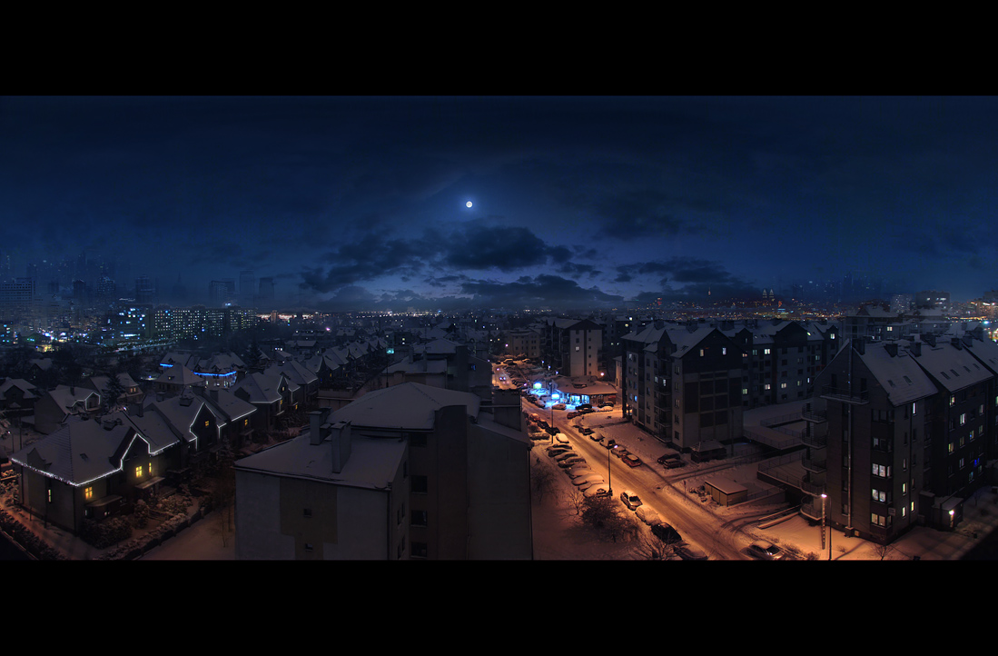
| Too Cold to go Inside - 2010 |
Sorry to pimp my own work here, but it helps prove my point: Winter has always inspired and fascinated me. So, now that I'm done waxing poetic, we arrive at the painting in question (go back and look at it, if you've forgotten what it is).
While Timkov undoubtedly has his own artistic statement to make with this work, I can't separate myself from how it hit me, so most of my analysis will be based around that.
What hit me right in the "Winter Nerve" (which I did not just make up) was how it managed to reconcile both of my views on Winter, while simultaneously depicting them in a completely different way.
The painting is of the Msta River bank, near the village of Valentinovka, which is just visible in the background of the painting. The most interesting and immediately noticeable aspect of this painting is its use of color. Blue is prevalent, as one might expect, but look closely at the type of blue used. It's more vibrant, more of a turquoise than the blues one is used to seeing in a winter landscape.
What is distinctive about the blues in this image, is that they are less rich than say, a royal blue (like in the first example), but more vibrant than a more muted blue that you might find in a more bleak snowscape. For me personally, this color choice perfectly mirrors my own feelings of unbridled child-like joy about the coming of winter, while at the same time capturing the essence of cold that is quintessential of the season. It just pops in a really interesting way.
The second thing I notice is Timkov's use of shapes. By portraying very familiar subjects (hills, rivers, trees, etc.), he trusts the viewer to know what they are looking at, which allows him to depict them using more abstract shapes. These shapes are most evocative, to me, of snow drifts. The way they slope and curve, forming soft corners at their vertices is very much representative of a naturally formed pile of snow. Realistically, the hills would look just like ordinary hills, but painted white (or blue, as the case may be), but by portraying them with these particular shapes, Timkov depicts to a T, the essence of snow, forming in giant piles on the ground.
Another aspect of this painting that I find interesting is its seeming lack of a subject. The absence of something drawing the viewer's immediate focus allows the subject to become the atmosphere of this quiet little riverside in the winter.
Well, that's all for this entry. If you didn't like this one, I apologize. The next blog will be back to my usual style. I just really wanted to say all this stuff. Anyway, see you next time (hopefully)!
No comments:
Post a Comment